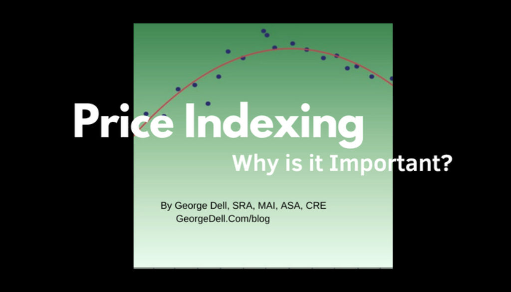
Price indexing is also known by other words, such as time adjustments or market conditions adjustments or trend analysis. A number of techniques have been recommended over the years. Most are flawed. Oddly, the algorithm mechanics of calculating are fairly simple and intuitive.
Best of all, once done correctly, the payoff is really high:
- You effectively increase the data available for comparison. For example, a very similar property is perfect, but is say 20 months ago, it becomes your best comp.
- It makes other adjustments easier to calculate and more accurate.
- It requires minimal modeling decisions – basically is it linear, or a curve?
- It is convincing to users/readers of your report.
- It provides an effective visual to your report.
- It contains much of what is usually needed in market analysis.
- It provides a great starting point in learning EBV© (Evidence Based Valuation©)
The algorithm and the visuals are simple, and easy to construct. The graph, trend line, and underlying formula (the actual adjustment) can be computer-completed in seconds. They can be done in a spreadsheet such as different versions of Excel® or open-source software. (In the Valuemetrics classes, we have been using open-source Gnumeric, so that everyone in class gets exactly the same results.) More recently, I highly recommend making the investment of learning in using R. R is the most widely-used analytics package in the world, and is destined to replace the accountant’s spreadsheet tool. It takes just seconds to create beautiful, correct graphs (scatterplot, trendline, and formula).
What’s wonderful about these tools (especially R), is that once set up how you like things, you can type a one-word function name, and R takes care of the rest. However, this is not like an AVM or canned appraisal software. You, the appraiser, make the important decisions, based on your prior experience, education, and training. You make two basic modeling decisions, which are easy to inform.
Within the graph, you use human skill and ability to generalize to fit a curve to the data selected. Usually this is between a linear or polynomial. In the Valuemetrics classes, we explain linear, spline linear, polynomial, and other curves. Each of these underlying formulas are to be applied directly to the number of days in the past the comparable sale took place. (That too is easy to program.)
The other, more important modeling decision you make, is the right data to include in the price index. This decision depends on whether you are doing exploratory data analysis (EDA), or predictive modeling. It also relates to how old your oldest probable comparable is going to be.
In the Stats, Graphs, and Data Science1 class, we emphasize the core data science principle: “When you get the data right, you are 80% good.” We apply the same five dimensions of similarity to the price-index data set as we did to identify our assignment data frame in the first place.
Because this one tool, this one model, this application accomplishes so much – it’s the one tool we strive to have students master. The in-class mastery creates confidence and results. Results which are immediately useful, and help provide a clearly superior product.
And you get to feel better about yourself too. What a deal!

August 11, 2018 @ 12:18 pm
I took George’s Stats, Graphs, and Data Science1 class this last week in Orlando. It was an EXCELLENT CLASS and I HIGHLY recommend that all appraisers get on the side of the appraising fence that actually does and shows the work of adjusting comparables through proper analysis and decision making.
Thank you George and I cannot wait for the next class. I WILL BE 1st to sign up !!!!!!!…
August 11, 2018 @ 3:56 pm
Thanks George, your Valumetrics class was one of best Continuing Ed courses in 25 years as an Appraiser. You provided an excellent forward thinking approach that I will seek to master and implement in all of my appraisals. Keep up the good work- this profession needs you. Best Regards