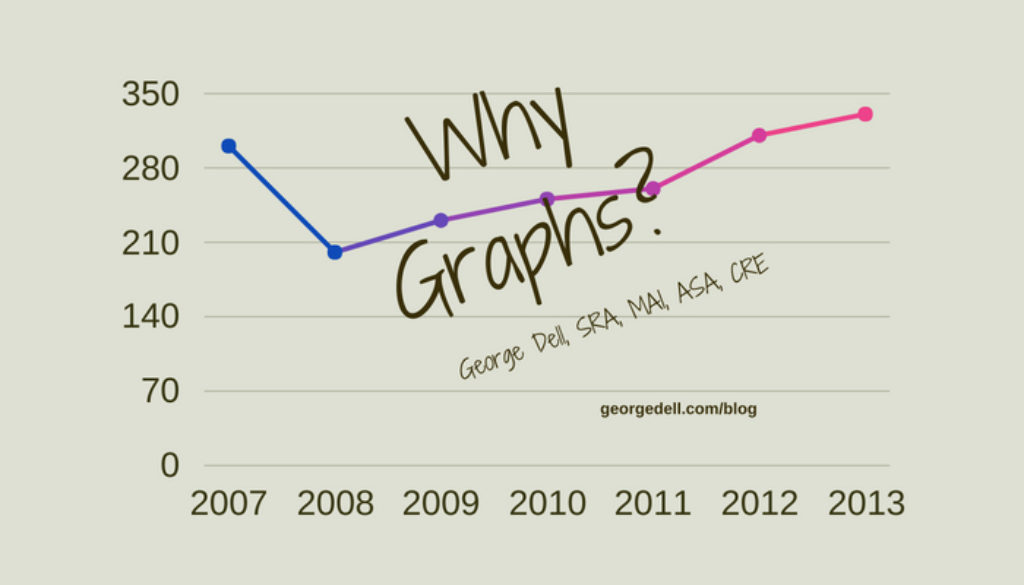
Graphs are pretty, have colors, and show things.
Graphs are visual. The human ability to see and to visualize is stupendous. It’s the main connect between the world about us and our ability to think, reason, and make decisions. Visualization includes graphic plots, tables, maps, moving and interactive displays, including three, even four-dimensional interface.
Part II of this series related the usefulness of four types of statistics. In today’s world, descriptives (summary parameters), such as mean, median, variance, skew, and quantiles, provide a way to summarize data so the human brain can cope and go on. For example, if you have the mean and the extremes of the data set, you already know a lot.
Plots and graphs provide even easier visual insight. For example, a distribution curve (like the bell curve) can connect with the human brain so quickly, that we tend to take it for granted. It also presents the shape of the data, (like if it’s peaked or flat or skewed).
In valuation, “the appraiser brain” can easily absorb and compare four or five sales data. In fact, the human brain is extremely good at generalizing from even 2 or three data points. But present the brain with eight or ten data points, and it simply zonks out. At that point, summary parameters and allow the human brain to understand the data, no matter how large. Why is this important?
It is important to understand and analyze whatever data is available. USPAP requires it! (See Standards Rule 1-4.) Analytically, it is important because you never want to throw away perfectly good information. More information always provides a truer and surer answer (accuracy and precision).
Graphs help fill in this important part of the analysis challenge. Computers provide the quick way to summarize data. Summary parameters are all you need. The difficult and convoluted inferential sample statistics are not necessary (such as p-values, confidence intervals, and hypothesis tests). In fact, they only serve to confuse the issue. “Appraisers don’t do no random samples.” Just because they are called “advanced analytics” does not make them an appropriate model for valuation.
USEFUL GRAPHS
The most useful graphs for appraisers include the following:
- Histograms and box plots, to describe a neighborhood, market segment, or property type;
- Bar plots, to show and compare any two or more groupings of data; and,
- Scatter plots, to show the association of two measure variables, such as price on size.
USES OF GRAPHS
There are four primary uses for plots of data: explore, classify, predict, and explain.
- Exploring helps with scope of work, identifying the CMS (Competitive Market Segment©), and identify the important elements of comparison (predictor variables).
- Classification methods categorize data, for example: “Is it a comp, or not a comp?”
- Prediction is the predominant model and purpose in valuation.
- Explanation in reporting of valuation results is a visually concise and clear method.
Finally, and most importantly, visual tools optimize the relationship between the strengths of the human brain and the algorithmic power of the computer. Data science explicitly recognizes the need for the subject matter expert. Evidence Based Appraisal© is the valuation application of data science.
© You are free to share, copy and redistribute, remix, transform, and build upon for any purpose, except commercially. Attribution – You must give appropriate credit and may not restrict others.
While I wish to help spread the benefits of the copyrighted terms and materials for the benefit of the valuation community, I wish to restrict those who would monetize or misinterpret or misapply the concepts as written. My experience has been that commercial users are the greatest violators of the open-source, creative commons principles of knowledge sharing.
Thus, we request attribution, share-alike, and non-commercial use only.
